Optimizing the Shopper Experience: 10 Strategies for Boosting Retail Sales
Vibrant displays. Products with a purpose. Cross-merchandising. What do these three things have in common? Each makes for a better shopper experience, according to Georganne Bender and Rich Kizer, experts on all things retail and featured speakers at SuperZoo 2023.
In the following article, Bender & Kizer share tips for visual merchandising that are applicable to retail businesses of all kinds, including pet retail. See what they had to say on how you can drive profit for your pet business by creating an intentional sales floor that provides the best shopping experience.
A version of the following article originally appeared on Kizer & Bender’s Retail Adventures Blog.
There’s a lot happening in retail right now.
While independent retailers were deciding whether to implement contactless payments, other retailers began accepting biometric payments that include use of fingerprints, iris scans and facial matching. That sounds strange until you remember you have been using your face to open your mobile phone for years.
Amazon stores — including Amazon Go, Whole Foods Market and Amazon Fresh — currently employ Amazon One, a “fast, convenient, contactless way to use your palm to pay at a store, present a loyalty card, enter a venue, or badge into work” to move shoppers quickly through checkout lines.
Recycling and sustainability are not fads and the reselling of gently used items isn’t either. Currently, retailers like Macy’s, Nordstrom and JC Penney all have resale departments on their sales floors and shoppers can’t get enough. There is an opportunity here for you, too.
Every crafter, for example, has a stash of material they are keeping for a future use that never seems to come. Why not devote a small section or rack to this product? Scrapbook and craft retailers have held in-store “garage sales” for years where customers bring in unwanted items to sell. Some retailers give sellers cash for the full value of items sold, less a 15% consignment fee. We prefer giving store credit, that way the money generated is recycled back into your store sales.
Yes, technology is everywhere, but the changes in retail aren’t all about tech. For example, designer stores have always used empty space to convey value, but now we are seeing that strategy carried over to other types of stores. Treasure hunt displays are still popular but even they are a little less cluttered than in previous years.
There is a syndrome called the Claustrophobia of Abundance that can overtake shoppers when there is too much clutter and too many choices to be made. When there are 12 different kinds of grape jelly in the grocery aisle or the dry cleaner offers an extensive list of options to have your shirts done, it can be overwhelming.
So, what’s a retailer to do? Optimize the shopper’s journey.
Create and Control the Shopper Experience
On the sales floor the goal is to move customers easily throughout your store by creating and controlling the shopper experience. You know that 50% of your store is never seen by shoppers, so your job is to artfully place fixtures and set irresistible displays that move them through the ENTIRE sales floor.
Below are 10 examples of retail displays designed to enhance the shopper experience that will spark new ideas and inspire you.
Example #1: A Chalkboard Wall and Flexible Displays
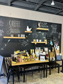
This display at a Taste of Benedicts & More in Crystal Lake, Illinois, is different every time we visit — and we visit a lot. The chalkboard greets visitors with fun quotes and valuable information about the product that’s displayed on the table. You can see the smaller tables stacked underneath that can be easily pulled out to expand the display. Flexibility makes a visual merchandiser’s — that’s you — job easier.
Example #2: Cross-merchandising to Increase the Average Sale
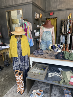
Boutiques are great at increasing the average sale: shoppers come in for one item but leave with five. This display at a Nashville boutique utilizes cross-merchandising to increase impulse sales. Shoppers don’t just see the dress, they see the complete outfit.
The same concept could be applied to a pet retail display by combining a fashionable leash, collar, seasonal accessory, and new toy to create a cohesive scene.
Example #3: Shopping in the Round
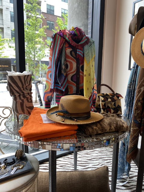
Hello double duty! This table serves as a merchandise outpost and a window display. It’s shopping in the round so customers can easily shop from all sides. This is particularly important when the display is in or near a window.
Example #4: Using the Psychology of Color
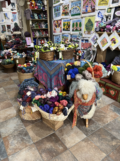
The world is a carousel of color! You sang that didn’t you? In the 60s Walt Disney himself introduced a generation of children to the Wonderful World of Color, and what a wonderful world it is!
Compared to other retailers, you’re already ahead because your sales floor is a constant sea of color. You don’t have to depend on decor to put shoppers in the mood to buy, but you do need to consider how you put those colors together in your displays.
People react to colors in different ways. Consider how your shoppers will perceive the color in your displays:
- Red is an attention grabber
- Pink is a light-hearted, soothing color
- Orange makes people happy
- Yellow is optimistic, warm and cheery
- Green is calming and refreshing
- Brown signifies warmth and security
- Blue represents trust, loyalty and confidence
- Purple is typically used to symbolize luxury, wealth and sophistication
- Both black and white are solid choices for backdrops because they make the merchandise stand out
The Quarter Stitch — a boutique yarn and needlepoint store located in the French Quarter of New Orleans — is an explosion of color. Note the use of neutral decor that allows the merchandise to take center stage.
Example #5 – An Interactive Selfie Station
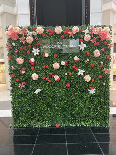
Woodfield Mall in Schaumburg, Illinois, taps into two trends here: Selfie stations and green walls. This one is constructed with inexpensive, but realistic, artificial green panels that are completely mobile.
If you have room for a full-time selfie wall, go for it! Dress it up by season or event and encourage shoppers to post selfies to their social media channels, along with your store’s hashtag.
Example #6 – The Story Behind a Window Display
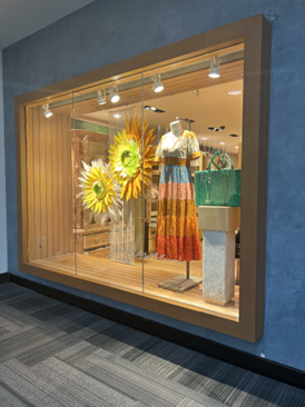
There is always a buzz about the window displays at Anthropologie but did you know that each one has a specific theme that goes far beyond what’s in the window? This one is called “A Sunflower Story” and it commemorates Earth Day.
The story page on Anthropologie.com shares that the sunflowers are handcrafted and made from sustainable materials that will be upcycled to plant pollinator gardens later on. That story page is an idea you should consider for your own store. You’ll get more mileage when you share your window story on your website, blog and/or social media channels.
Example #7 – A Unique Use of Props
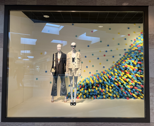
Nordstrom cuts and stacks pool noodles to add color to some basic outfits on blend-into-the-background mannequins. We’re not crazy about this window display, but we give Nordstrom a 10 for its use of props.
Great ideas are everywhere! As you peruse the aisles or Target and Walmart and the like, think about how the unusual sale items you come across might be integrated into your store and window displays.
Example #8 – Multilayered Product Signage
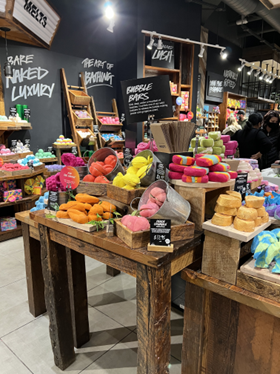
It’s a well-known retail fact that displays with signs sell better than displays without them. The purpose of your signing program is to influence how customers shop and to encourage impulse sales. Lush covers both bases with two types of product signage at counter level, plus wall signage that’s guaranteed to capture attention.
Example #9 – Personalized Recommendations
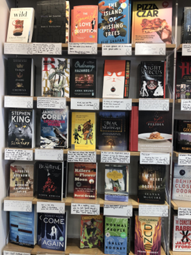
These little shelf-talkers at Barnes & Noble Booksellers, created by the store associates, give a 2-4 sentence description of the book behind them. Note that there is a Barnes & Noble ampersand on every sign. This carries the brand identity throughout the shopper experience.
Example #10 – Encouraging Visitors to Shop Local
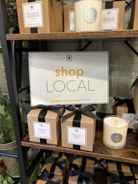
It’s perfectly acceptable to remind customers subtly and tastefully about the importance of shopping local. This sign is well done and in line with the store’s brand theme. And it is far above the handwritten and taped pleas to shop small that we usually see on our retail adventures.
Visual merchandising will always be an essential driver of your success. Remember to keep a close eye on the product you carry, how it is presented, plus everything else necessary to increase customer dwell time — the amount of time shoppers linger in the store and at each display. You have a picture in your head of how your store is perceived; it’s important that customers share that same perception.
Industry change is good, but so is change on your sales floor!

About the Author
Rich Kizer and Georganne Bender are consumer anthropologists, keynote speakers, authors, and consultants who have helped tens of thousands of businesses in the retail, creative, restaurant, healthcare, hospitality, collegiate, travel, beauty, funeral, tech, auto, sales, and service industries since 1990. As global retail thought leaders, KIZER & BENDER are listed among the Top 40 Omnichannel Retail Influencers, the Top 100 Retail Influencers, and the Top Retail Industry Experts to Follow on Social Media. For more about Kizer and Bender, visit https://www.kizerandbender.com/team/richandgeorganne.
Meet Kizer & Bender at SuperZoo
Don’t miss Rich Kizer and Georganne Bender at SuperZoo 2023! Catch these sessions that are designed to capture your shoppers’ attention and entice them to buy. For more about SuperZoo’s leading education program for pet retailers, see the complete Education Schedule and Pricing. Registration is now open, and it’s FREE to register in advance for qualified retailers, distributors, and pet services.
August 15, 2023
The Path to Purchase: How to Optimize the Shopper’s Journey
August 16, 2023
6 Easy Ideas to Set Your Sales Floor to Sell